

In the spring, the Pantone team began looking for the next year's fashion colors, which will cover many areas, including film, fashion, pop art, and packaging design.
Every autumn, the four seasons are coming to an end, but it seems to be the beginning of the fashion world. In the fast-paced fashion circle, the four major fashion weeks are held in the order of New York, Paris, London and Milan. They are headed by New York Fashion Week in early September and release the fashion design for the spring and summer of the coming year.

Color master Pantone has already pre-empted the popular color trends of spring and summer of 2019. Like 2018, Pantone not only lists 12 colors that express the new vision, but also released 4 neutral colors.
According to PANTONE Color Institute, in 2019, under the expressionism of playful style, it is encouraged to express color by unconstrained experiments. From these 12 color combinations, it reflects people's desire to face the future with joy, confidence and excitement, and to lead to unexpected creative combinations.
These 12 colors are bright but not too strong. They combine high-end fashion and street style, and are suitable for both men and women. It also proves our desire for real and creating accessible designs.
The following are Pantone 2019 spring and summer fashion colors, as well as the PANTONE Color Institute interpretation:
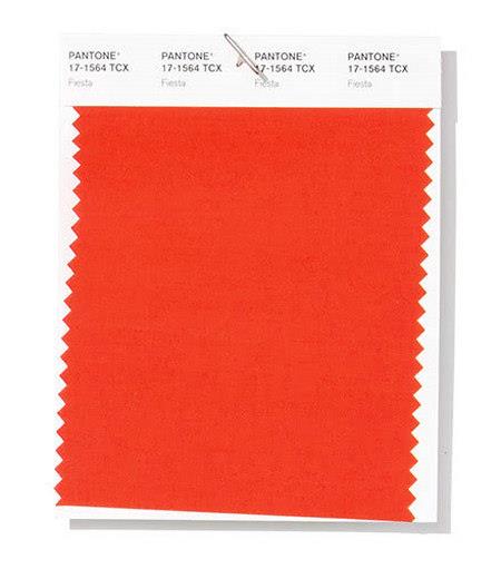
Carnival PANTONE 17-1564 Fiesta
With a touch of festive orange, people feel the enthusiasm, excitement and energy.
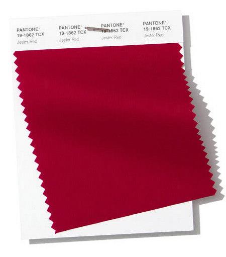
The combination of extreme elegance and a sense of the city adds to the depth and intensity of color.
Turmeric is a lively orange color that adds a hint of excitement to the palette.

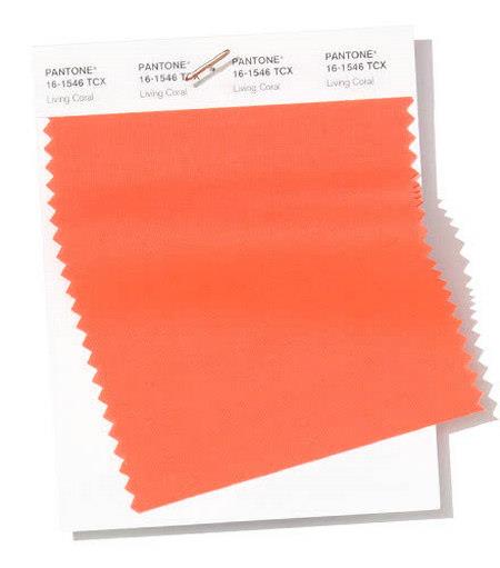
The living coral, which is based on gold, softens the edges of the color and creates an amiable feeling through the dynamics of the shadows.
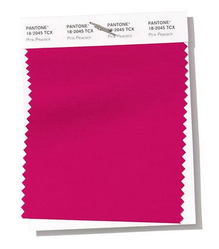
The dramatic pink peacock exudes a visually feast.
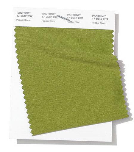
The yellow-green mixed pepper stems cause a desire for natural health.
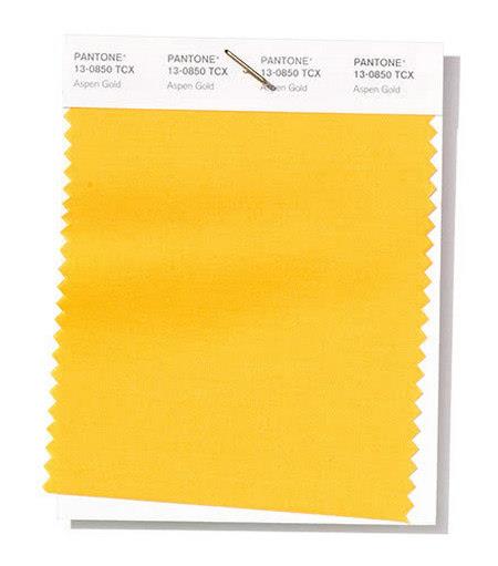
In the sun, the golden poplars inspire a pleasant mood.
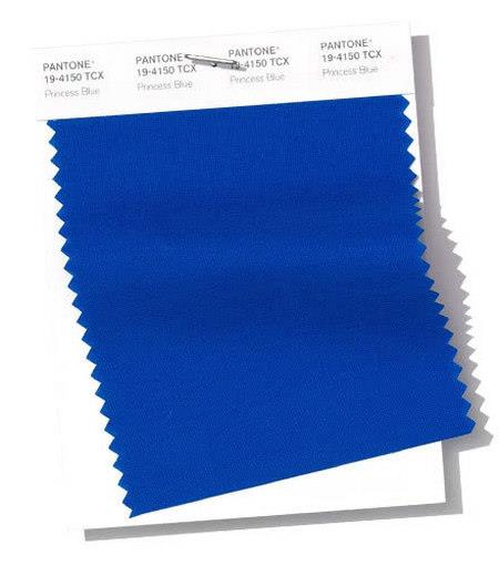
The sublime royal color shines.
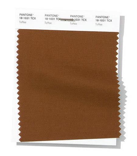
The taste of toffee is irresistible and triggers an appetite.
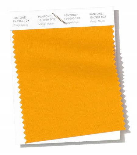
The golden mango Mojito feeds our hope for joy and comfort.
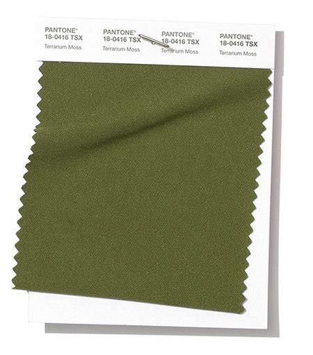
Reminiscent of the lush foliage and the beauty of nature.
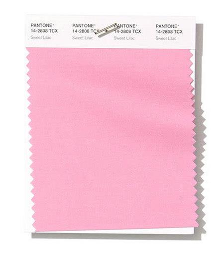
The field cloves are pale pink lavender, which is simple and gentle to show the charm.
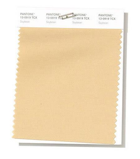
The subtlety of the bean color naturally gives a feeling of being reliable and suitable for multiple places.
Dark blue is reminiscent of midnight, as mysterious and serious.

Soft and creamy color touches the heart.

Solid earth, low key

Since 2000, Pantone has determined the trend of the next season's fashion trends with the trend, the most important of which is the annual fashion color. Of course, they are not a slap in the head, they are fixed with a finger color card.
Therefore, in the fashionable industry of drinks, keeping up with the popular colors, it is also keeping up with the trend of the times, and grasping young people from all aspects of life and entertainment.
Pantone's popular color is not just a prediction. It hopes that everyone can think about "the global spirit of the year" through the discussion of color. Therefore, Pantone's popular colors often have its meaning and symbol.